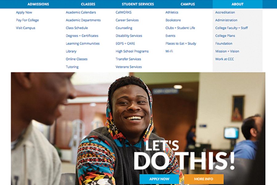
website sheds ‘broken’ design
Apr 11, 2017
The redesigned Contra Costa College website went live last week and the upgrade was immediately noticed by students and staff.
Instead of adding lots of information, the new website was designed to provide quicker load times and streamlined navigation for students, staff and the community, Marketing and Media Design Director Brandy Howard said.
“The (old) website was not reflective of the current programming of the school,” Howard said. “We want to change the perception people have of the college when they look at us online.”
She said she facilitated the website redesign project through El Cerrito-based web design company Rootid, and with the help of students, faculty and staff.
She said the $20,000 used for the redesign was drawn from CCC’s marketing budget.
Despite the redesign, the site still has most of the same information from the previous website, she said.
“We redesigned the site to better showcase Contra Costa College for prospective students,” she said. “The old website was really outdated or broken.”
The website is no longer hosted at CCC, but will now be hosted by Pantheon Website Management Platform (PWMP).
Howard said performance has increased now that a third party, PWMP, hosts the site remotely. The redesign process also prioritized how the site would function on mobile phones and tablets. This was an important part of the design process as the majority of prospective students predominantly access websites via mobile devices.
CCC Dean of Enrollment Services Dennis Franco said, “We’re hoping this effort will make CCC more attractive to prospective students and to make accessing the information needed to make the decision to come to CCC easier.”
The website’s new drop down widget allows the college to display yellow alert messages with important information, as well as standard banners with information that can be changed on a daily basis.
Howard said there was a recognized need to redesign the website for prospective students and make it easier for them to choose CCC and move through the enrollment process.
Franco said, “I think there was a general desire on the part of students, faculty and staff to have a more user friendly experience with the website.”
Howard said initially most of the information will be the same, but they will be working with academic departments and student services in the coming months to re-write much of it so that it is “more inspiring and actionable.”
“Any sort of critical updates or emergency announcements will be displayed on a yellow message at the top of the page showing any issues students or faculty need to be aware of,” she said. “We hope to make it easy for users to find the information they are looking for and that any instructions for completing a task are written in simple and easy to follow language.”
Howard said they plan to incorporate more videos and infographics, but are currently focused on continuing to establish the foundation of the new website so that they will be able to build upon it.
“Websites are dynamic beings. They are constantly in motion like humans. As we collect and analyze user data and as the college’s offerings grow and change, we will continue to make improvements,” Howard said.
She said they plan to hire a writer to revise all the text in the assessment and orientation section.
Technology Systems Manager James Eyestone said the new website will continue to run on WordPress and parts of the old website will still be hosted at CCC.
Of the redesign he said, “It’s a lot like updating a phone book but all digital.”


